Is Bitcoin Still Good Value?
Bitcoin has had an incredible start to the year, up 70%, making it arguably one of the best-performing assets in 2023.
As we move into Q2, how well can Bitcoin perform from here, and can we consider it to still be good value?
We can understand this better by looking across a number of price cycle metrics and blockchain indicators.
Bitcoin Investor Tool: 2yr MA Multiple
One of, if not THE most simple tool for Bitcoin long-term investors is the 2yr MA Multiple. It is able to identify when $BTC is broadly over or undervalued.
When $BTC price is around or below the 2yr moving average (green line) it can be considered to be undervalued by the market.
When it is around or above the x5 multiple (red line) of the 2yr moving average, it is likely becoming overvalued by the market.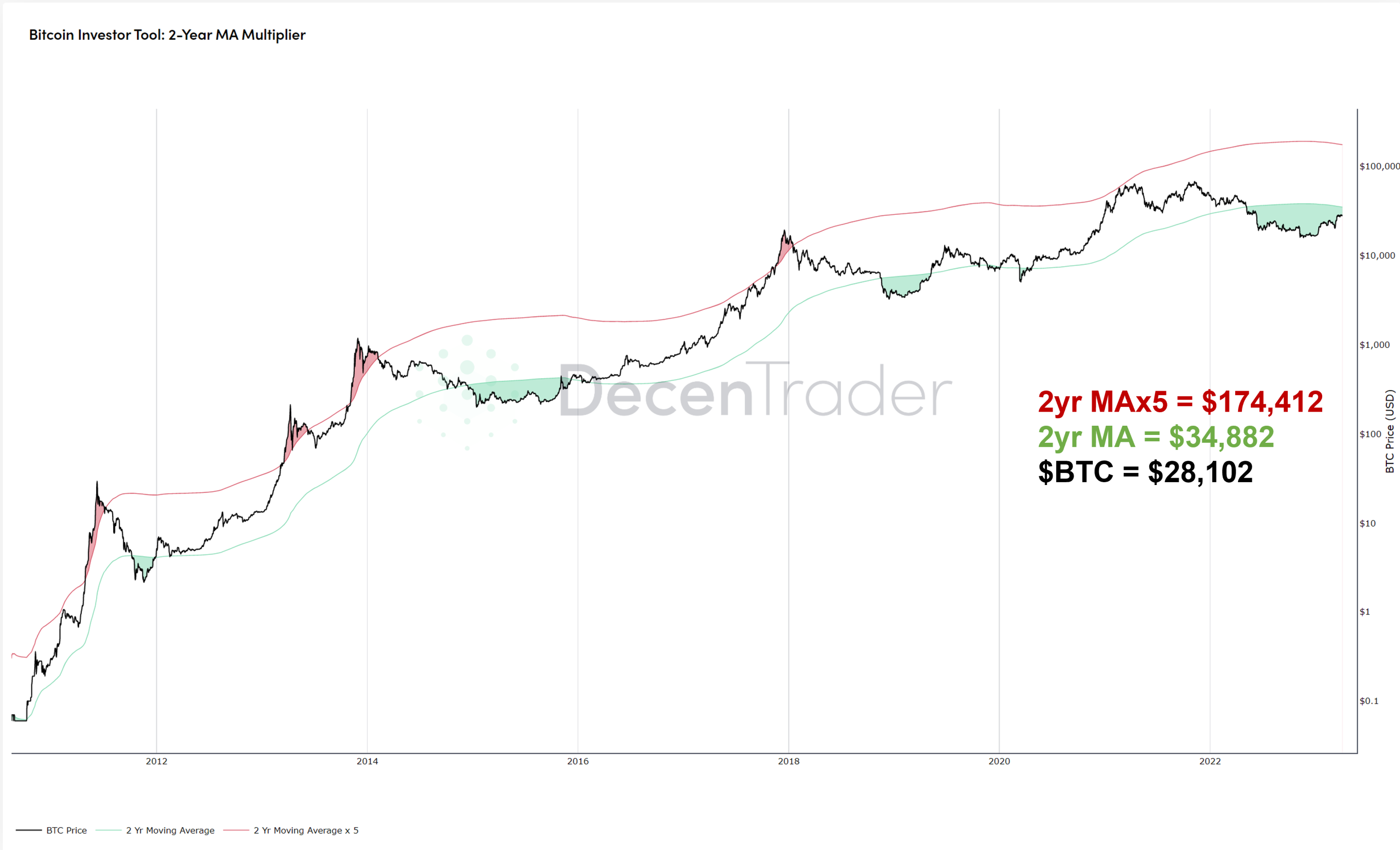 Figure 1: Bitcoin Investor Tool: 2yr MA
Right now $BTC price remains below the 2yr MA ($34,882) suggesting that it is still undervalued by the market according to this metric.
Spent Output Profit Ratio (SOPR)
SOPR is a useful macro sentiment indicator as it examines whether investors are selling in profit or loss in USD terms.
It is calculated by dividing the realized value of a spent output (in USD) by the value at creation of the original UTXO (in USD).
In simple terms, this can be explained as…are the bitcoins leaving the wallet worth more in USD than they were when they entered the wallet?
That answer is then aggregated up at a market-wide level. So on any given day, we can see if selling is in profit (red spikes on the chart below) or loss (green spikes).
In overheating bull markets there are consistently high red spikes on the chart as wallets are in large profit when moving their bitcoin.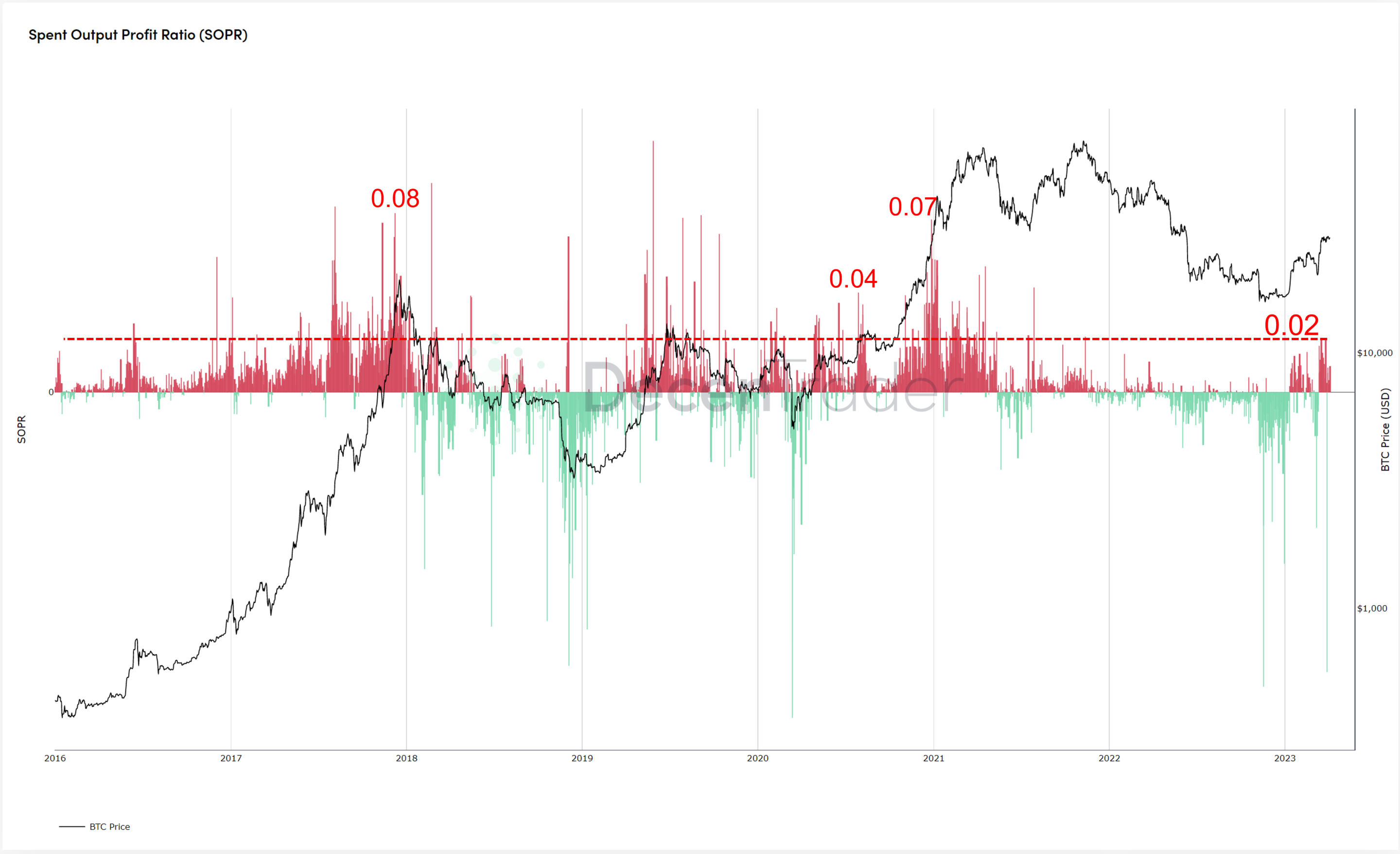 Figure 2: SOPR (Spent Output Profit Ratio)
Currently, this is not the case. Recent profit selling was low by historical comparisons, with a high of just 0.02. In addition to this, in recent days as $BTC price has stalled, SOPR has been close to turning negative where aggregated selling would be at a loss.
This suggests the market remains a very long way from becoming overheated.
1yr HODL Wave
Probably the cleanest onchain metric for demonstarting behaviour of participants on the blockchain. The 1yr HODL wave shows the percentage of bitcoins that have not moved on the blockchain for at least 12 months.
It therefore shows the behaviour of market participants who are playing a more strategic long term game. Accumulating when price is low, distributing (selling) only when price goes much higher.
That creates an inverse line chart relative to price. When price goes up, the 1yr HODL wave goes down as those strategic investors sell and the percentage of coins not moved for over a year starts to decrease.
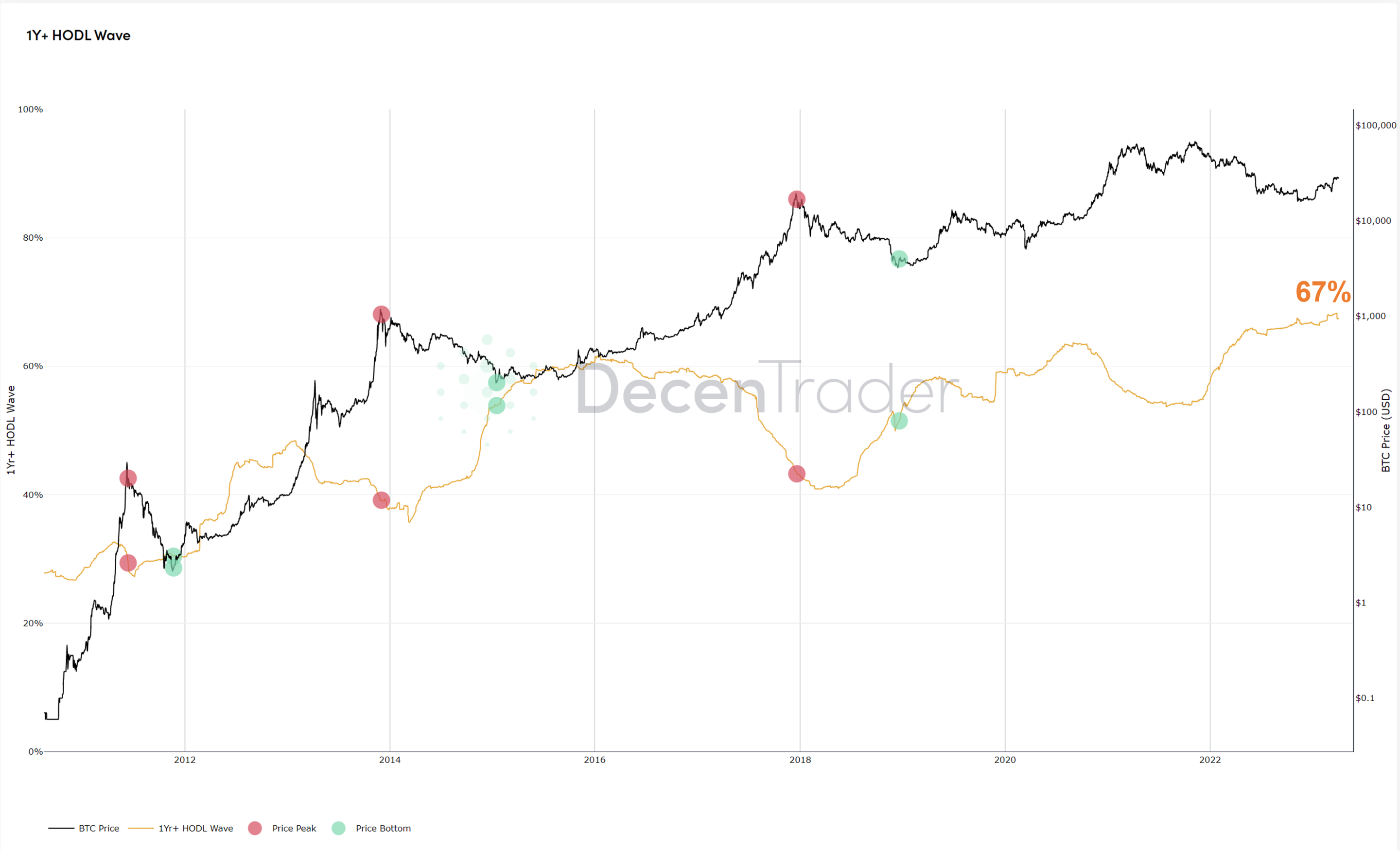 Figure 3: 1yr HODL Wave.
The 1yr HODL wave currently stands at an incredible 67%. That means 67% of bitcoins have not moved onchain for over a year. The 1yr HODL wave line is now starting to plateau and will gradually drop as price increases.
We are only at the start of that process and supply will remain restricted until significantly higher prices are achieved. At which point, long term holders will sell their bitcoin bringing more supply onto the market.
VDD Multiple
Value Days Destroyed (VDD) Multiple compares recent spending behaviour onchain to the yearly moving average.
It is able to highlight when older coins begin to rapidly enter the market to be sold. This typically happens when longer-term participants look to take profits as price accelerates up in major bull market cycles. It can therefore indicate major cycle tops.
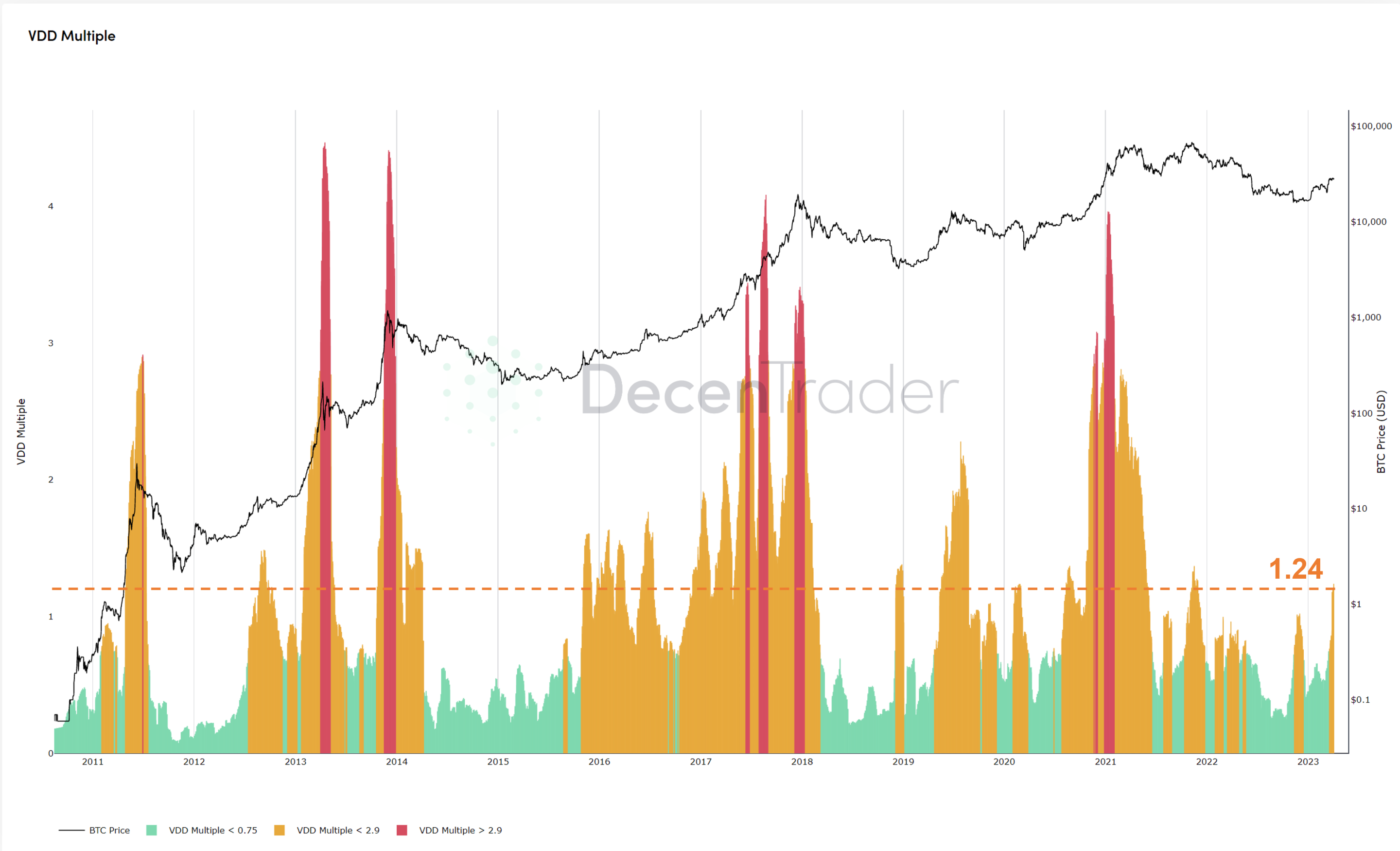 Figure 4: Value Days Destroyed.
Recent spending behaviour has been low on a relative basis where new coins have been moving onchain. This is typical in late bear / early bull market phases where most long term participants are accumulating or inactive. This behaviour is related to the 1yr HODL chart discussed previously.
The recent spike up in price to $28,000 has pushed VDD to 1.24, which is comparable to the very early stages of previous bull markets.
Again, demonstrating that Bitcoin still has a lot more potential upside this cycle.
NUPL (Net Relative Unrealized Profit/Loss)
NUPL shows the paper profits of Bitcoin investors.
It is calculated as follows:

Where Realised Cap is the average cost basis of the market.
Market sentiment categories are then overlaid on top of the chart to make it easier to see when the market is overly fearful or greedy.
This metric has just recently entered ‘Optimism’ territory, after pulling out of Capitulation at the start of the year.
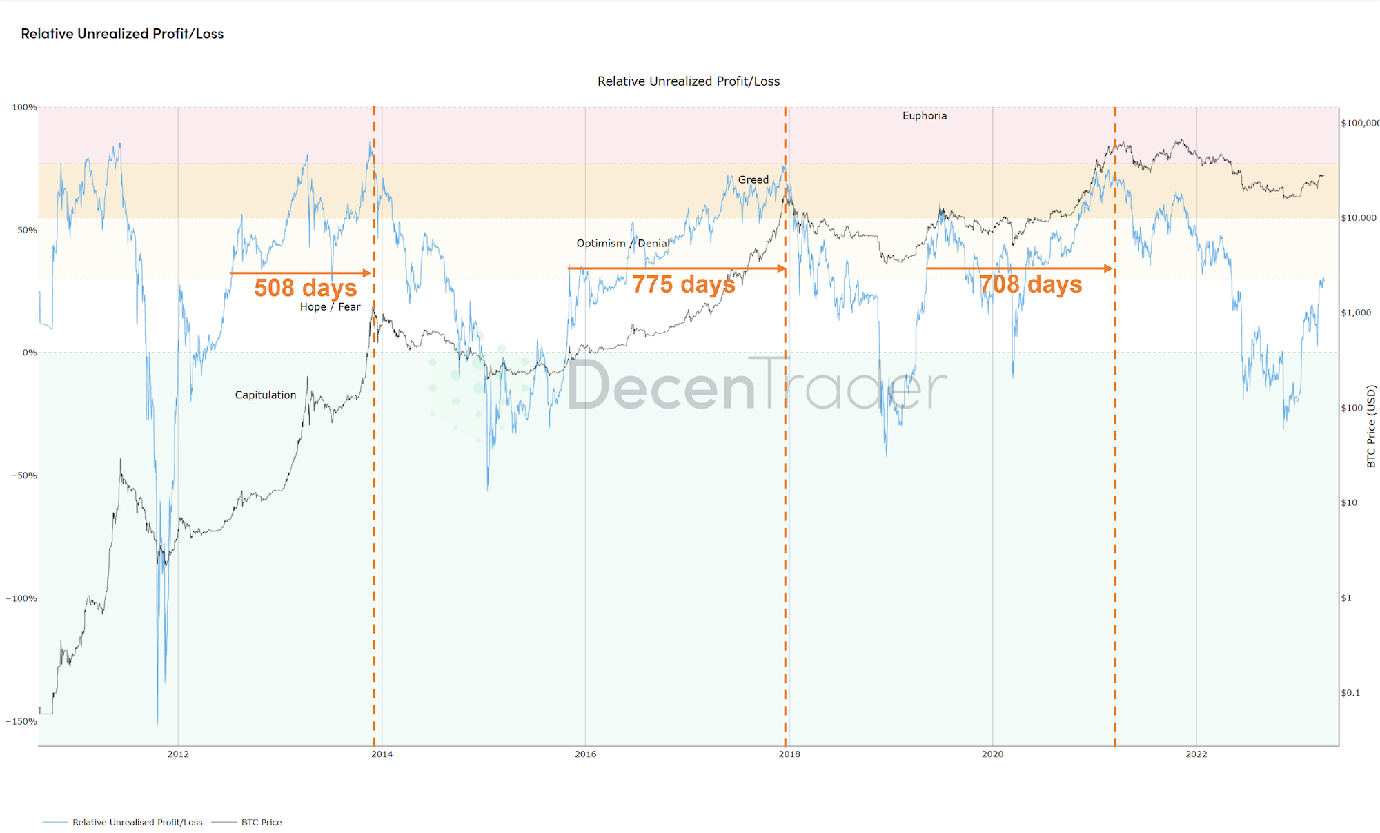
Figure 5: NUPL
In previous cycles, after NUPL first breached Optimism, the market did not top out for another 508 – 708 days afterwards.
While the bottom is now likely in and the absolute best time to accumulate was likely back in Q4 2022, there is still a very long way to go before this market gets overheated and we see signs of the bull run being over.
This bull market will no doubt be as volatile as previous ones, but the direction of travel is most likely going to be up for the foreseeable future. These current price levels for Bitcoin are still very good value.
Disclaimer: Nothing within this article should be misconstrued as financial advice. The financial techniques described herein are for educational purposes only. Any financial positions you take on the market are at your own risk and own reward. If you need financial advice or further advice in general, it is recommended that you identify a relevantly qualified individual in your Jurisdiction who can advise you accordingly.


