What Next After the Major Downturn?
On Wednesday we witnessed major panic and carnage in the market with a $14,000 red candle on $BTCUSD. Let’s take a look at what happened and what may come next.
Post Pi-Cycle Top Price Action
In previous newsletters, I spoke about how I expected Bitcoin to range after our Pi Cycle Top indicator triggered a top signal. That was the case for more than a month as we can see on the chart below. Bitcoin was continuing to range in the shaded area it had been in since February:
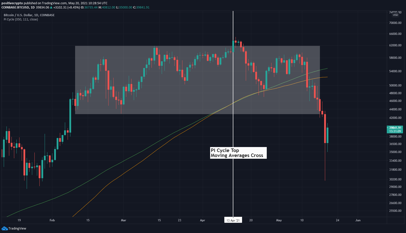
Figure 1: Bitcoin had continued to broadly range since the Pi Cycle Top triggered.
Side note: It is fair to say I will be paying close attention to the Pi Cycle Top Indicator next time the 111DMA (orange line) crosses back up above the 350DMA x2 (green line)! That may well signal another major top.
Leveraged traders trigger the cascade
Unfortunately, once we saw some FUD media headlines around Elon Musk, China ban, etc, we started to see leveraged traders on trading exchanges keep trying to buy up any dip in price.
This was visible in funding rates and predicted funding rates. Funding rates are what traders pay to other traders who are betting the other way. Positive funding rates mean traders who are expecting price to go up are paying a fee to traders who are expecting prices to go down.
Over the past 48hrs, predicted funding rates kept spiking up on every dip in price. Indicating that long traders kept trying to buy the dip. As price moved down, the traders were betting more and more until eventually they got blown out and it triggered a liquidation cascade causing price to nose-dive down.
Here are current funding rates which are mostly flat or negative (green). This was not the case yesterday where predicted funding rates were stubbornly positive:
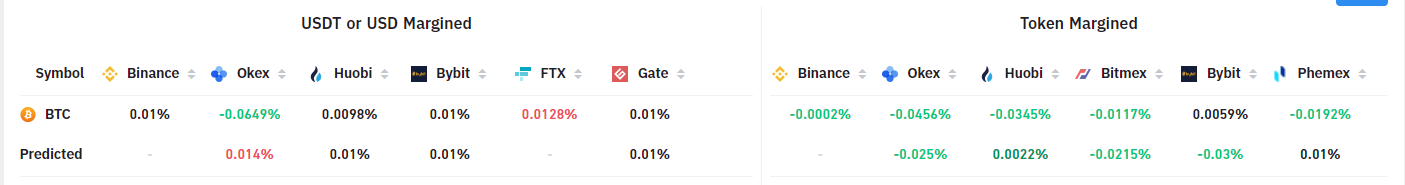
Figure 2: Funding rates for Bitcoin across exchanges.
As we saw yesterday, short-term trader activity can have significant impacts on price when leverage is built up.
Predator was indicating the market was due to turn down
The Predator tool had been indicating for some time that the market was looking weak. On the weekly chart here we can see it turned red the 3 weeks before this week’s crash.
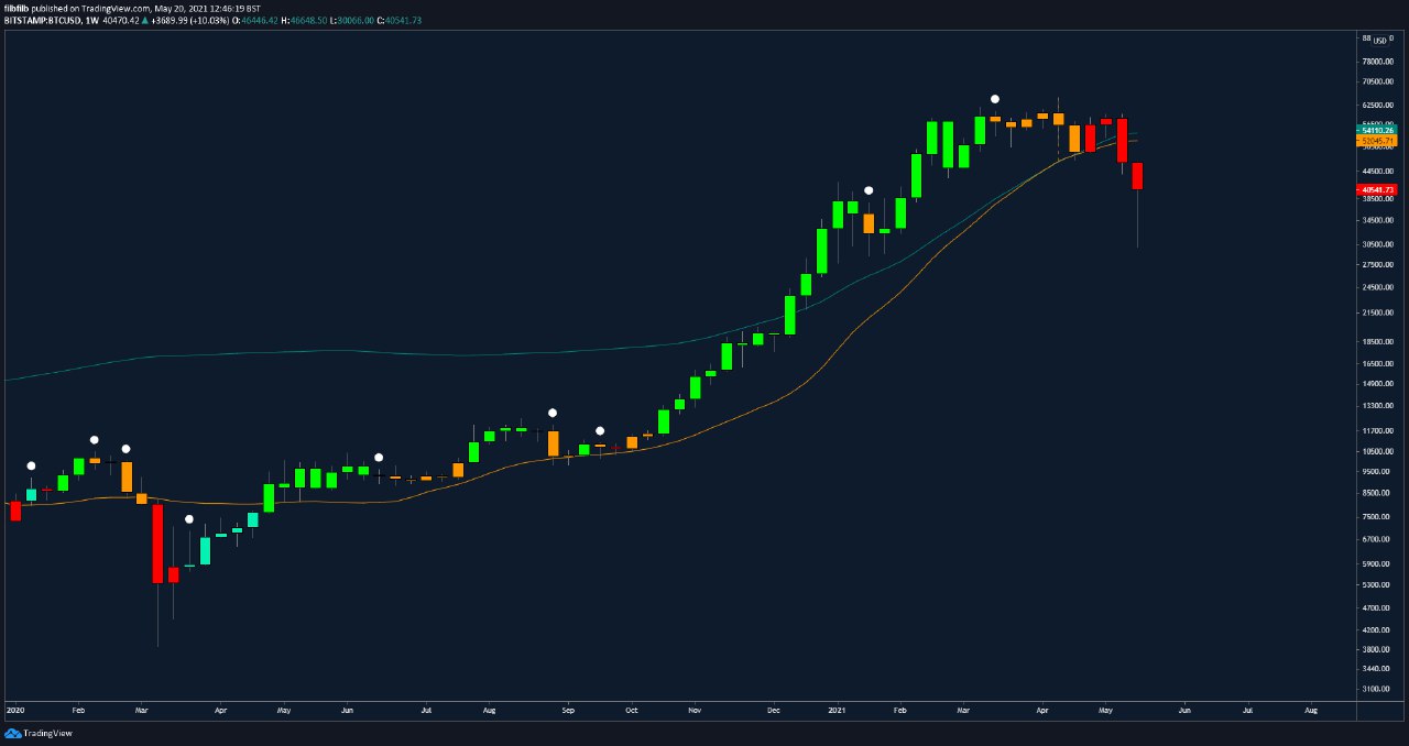
Figure 3: Predator was painting red bars warning of a potential downturn.
You can access the Predator indicator here
Near Term Bottom Forming
Zooming in on the past 36 hours, we look to have had a very clear capitulation bottom forming yesterday.
This shape bottom has happened multiple times in Bitcoin’s history. A sharp spike down and a ‘V’ shape recovery on low time frames as longer-term minded participants with cash on the sidelines aggressively buy the dip.
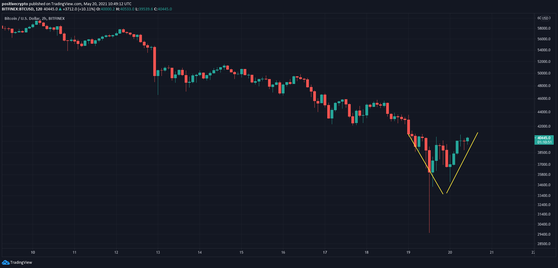
Figure 3: Capitulation wick and a ‘V’ shape recovery is promising.
It may take some time to grind our way back up but I do believe the bottom is in now for $BTC price.
On-chain wallets selling at a loss…further evidence of a bottom
On-chain we saw that wallets were having to sell at massive losses over the past couple of days. This is incredibly rare in a Bitcoin bull market and signifies a major bottom forming.
It is shown here by the green bars on the Spent-Output-Profit-Ratio (SOPR) chart below. These green bars only appear during major corrections in $BTC price and are rarely this big:
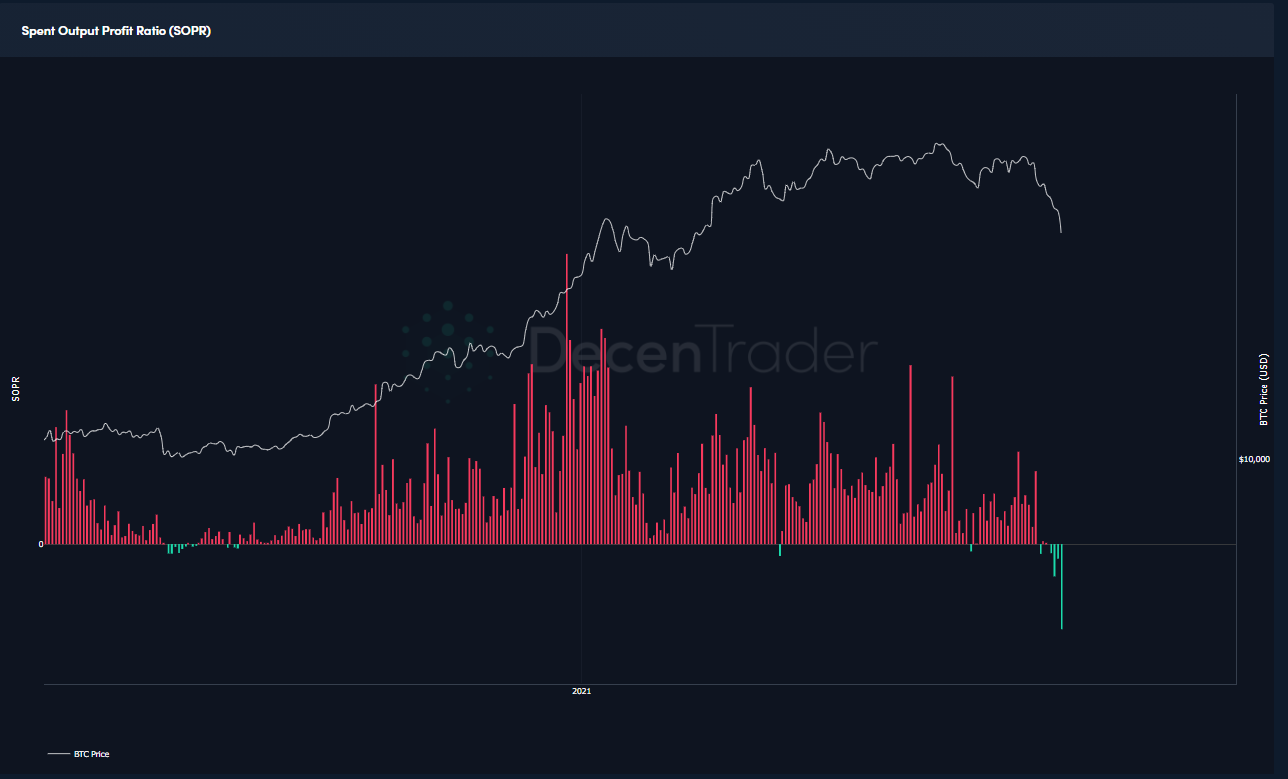
Figure 5: Spent Output Profit Ratio showing a ‘buy the dip’ opportunity on-chain.
This on-chain data does suggest to me that many wallets capitulated and sold on Wednesday. Which has historically presented a good time to buy the dip for buying and holding bitcoin on a long term scale.
The live chart can be viewed here at Decentrader.
Zooming out to stay calm
Several long-term indicators continue to demonstrate that we are not at the macro top of the cycle…even if the Pi Cycle Top did signal an intermediary top.
The 1yr HODL chart looks at the percentage of bitcoin that has not moved from one wallet to another for at least a year. In doing so, it shows us the percentage of all bitcoin that has been HODL’d for at least a year:
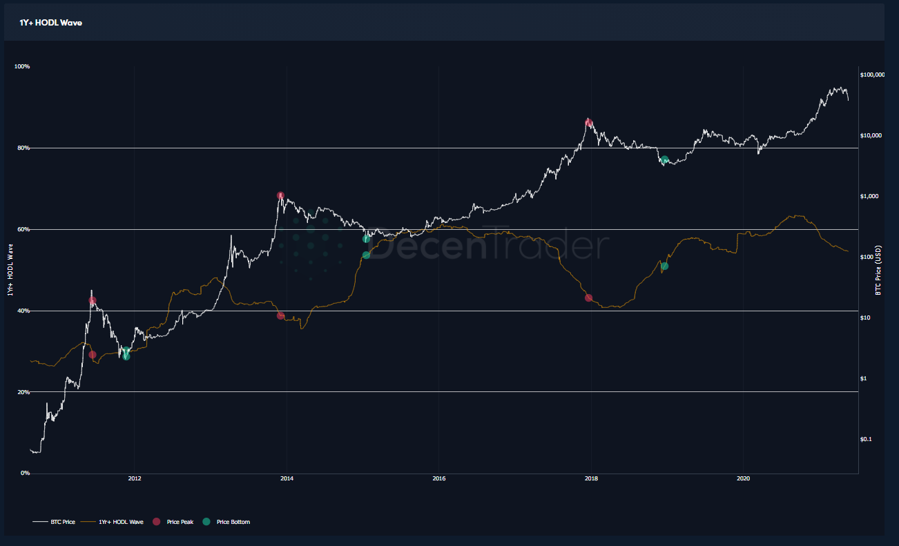
Figure 5: 1yr HODL chart.
We see that the 1yr HODL line (orange line) has an inverse relationship to the price (white line). That is because as price accelerates in a bull market HODL’ers take profit and therefore coins move from their wallets, bringing the 1yr HODL percentage line down.
The red dots on the chart show the corresponding levels of where the market cycles topped out. At previous market cycle tops the 1yr HODL percentage was in the mid-low 40% areas.
Currently, the 1yr HODL is still up at 55% and I would expect it to be down towards at least 47% before we are close to the macrocycle top.
So for now I think Bitcoin has bottomed in the near term, and more importantly, I believe it looks good on longer timeframes…so I will continue to HODL Bitcoin!
Stay safe and speak again soon,
Philip Swift.
Disclaimer: Nothing within this article should be misconstrued as financial advice. The financial techniques described herein are for educational purposes only. Any financial positions you take on the market are at your own risk and own reward. If you need financial advice or further advice in general, it is recommended that you identify a relevantly qualified individual in your Jurisdiction who can advise you accordingly.


