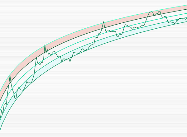
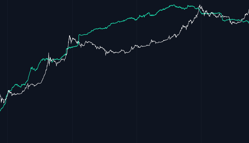
How the Chart is Formed: This chart is built from historical Bitcoin price data and is designed to reflect the long-term trends in Bitcoin’s...

How the Chart is Formed: This chart is built from historical Bitcoin price data and is designed to reflect the long-term trends in Bitcoin’s...
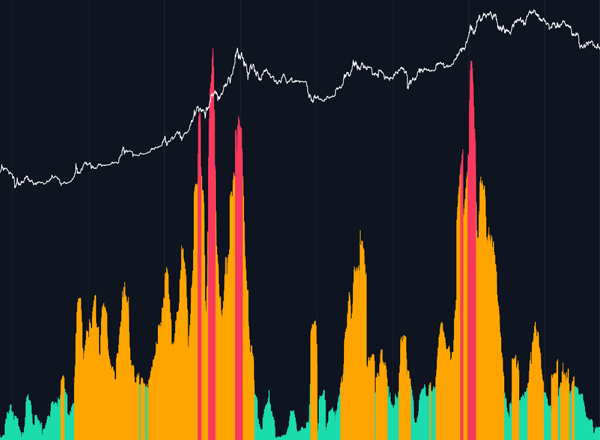
Liquidity Maps are extremely useful for visualizing liquidation areas on a tradable asset. They can be used by market participants to optimize...
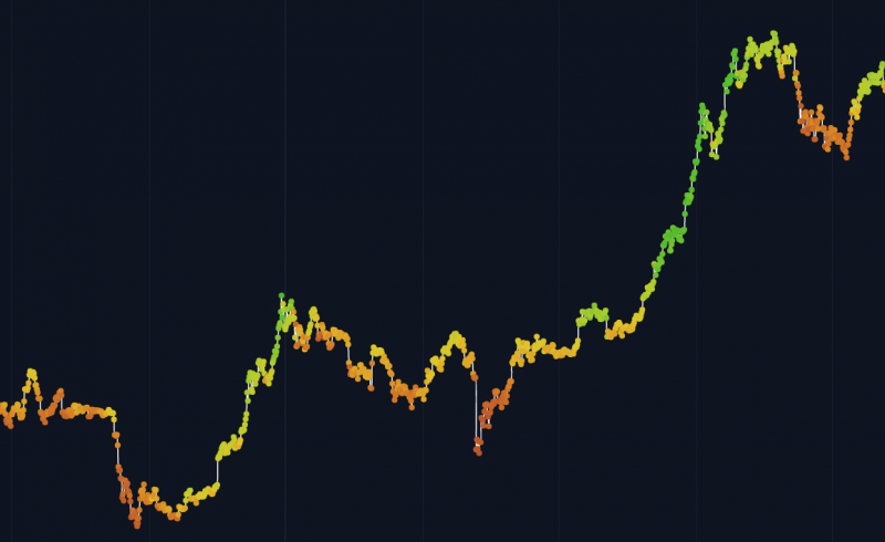
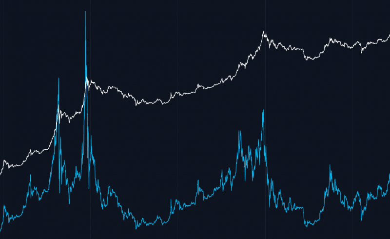
Chart Overview MVRV stands for Market Value to Realized Value and is a way to identify whether Bitcoin price may be under or overvalued at any moment...
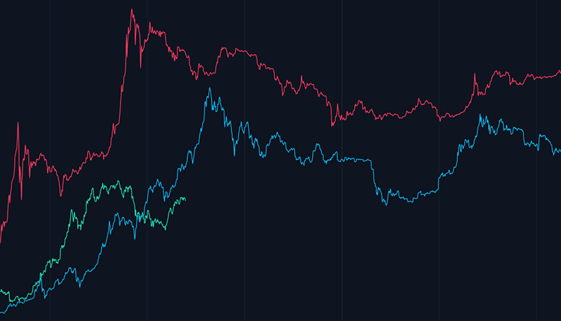
This chart looks at each of the 3 major Bitcoin cycles since their relative halving dates. Each line starts at the halving date and the x-axis runs...
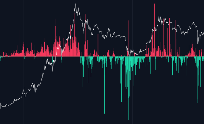
What is SOPR? Spent Output Profit Ratio (SOPR) is a proxy visualization of profit-taking on the blockchain at any given moment in time. Let’s take...
Get our Market Updates for free, directly to your inbox